


Minh Lam needed a distinctive, recognizable illustration to represent its highland teas across a growing product range. We built that image around an ancient Shan Tuyết tea tree and the people who harvest it, then extended the story from packaging into illustration artwork for a mural at the Ecopark teahouse.
Folktales’ role: Concept development, illustration, packaging layout, color development and illustration artwork for the mural.
The brief
Develop a distinctive packaging concept with a clear connection to Vietnamese tea culture and a contemporary aesthetic. The design needed to distinguish between teas while keeping the whole range recognizably Minh Lam.
This called for a consistent illustration structure: a visual foundation the brand could continue to use as product names, colors and formats changed.
Putting the tea's origins at the center
The ancient tea tree became the project's central idea.
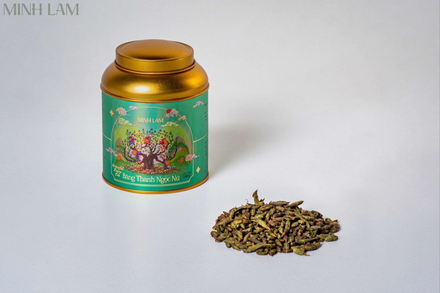
Its broad trunk and spreading branches connect the whole composition. Tea pickers appear among the branches, linking the product to the people and work behind it. Mountains, clouds and a rising sun place the scene within the world described by Minh Lam's brand story.
The image brings origin, craft and atmosphere into one scene. The product gains a world of its own, while tea picking becomes part of a customer's first encounter with the tin.

Making the important details visible first
Development focused on the image's visual hierarchy.
Following client feedback, we emphasized the trunk and kept the tea tree and pickers as the main subjects. Surrounding patterns and foliage took a supporting role. The palette became warmer and richer, while details of the clothing were refined using reference material.
These choices matter at packaging scale. Even a detailed scene needs to make a clear first impression. The tea tree provides that first point of recognition; the figures and smaller details invite a closer look.
The packaging options also considered how the illustration would sit alongside product names and bilingual information on the curved tin. Artwork and layout needed to work together so the story remained visible and shoppers could easily identify the tea.

Creating variety within a consistent range
Across the color options, the central scene stays consistent while the surrounding palette changes.
Each tea gains its own character without starting again with a completely different visual story. Together, the tins form a coherent range. On its own, each still carries the distinctive tea tree and a sense of place.
Product photographs show the approach across different teas and tin sizes. Color creates variety; the repeated composition holds the range together.

Extending the story into the teahouse
For the mural at Ecopark, we developed the signature scene into a wider landscape. The tea tree remains the anchor, with terrain, foliage and figures added to suit the proportions of the wall.
At this scale, details that once appeared on a small label become part of the surrounding space. Visitors encounter the same story on the product shelf and in the room where they enjoy their tea.
The result is a visual connection between product and place. Minh Lam's signature illustration can help identify a tea, connect a product range and create an atmosphere for experiencing the brand.

Give your product story room to grow.
Have a story in mind? We help shape the concept and creative direction. Start with a free 30-minute call to find the right approach for your project.